After having my eyes opened to the wonders of hand lettering in design, I have been unable to escape it. It’s everywhere now; from adverts on the tube to the back of a PG Tips packet:

I really like the curly-wurly arrow, it’s a lovely touch, but look at the way the T, A and S sit together in “taste”….

Tasty
Nice! And the fact that it’s all done in pencil-even better! The F and R of “free” may be a bit close together though….
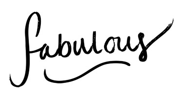
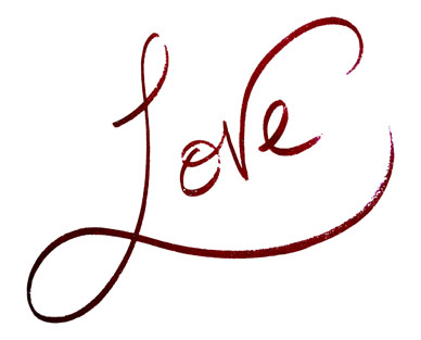
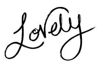
It reminds me of some rough lettering I did for myself a few months back. I traced most of it in Illustrator to make it clearer (and to hide the face that I am currently without a scanner):


Mmmm….grainy! I do like this style of lettering; I have whole sketch books full of the stuff-it’s strangely hypnotic to write the same word over and over again, changing something small everytime. The word “Lovely” appears A LOT in my books. It’s a damn good word! This style always ends up just a big version of my normal handwriting though (you have to do this stuff big…and with a huge pen). I think I’m better at block lettering:

Type....get it? Ha!
I did this a while ago and cannot stop fiddling with it! I’m always rearranging the words and resizing them *sigh* I think it’s fun though. Scribbles are good. As is mixing lower and upper case :) it’s not for everyone but I’m throwing it out there.
I’m going to have to keep a decent record of all the handlettering (good and bad) I find. And with that I’m off to find the cable that connects my phone to my computer after I lost it it ran away…