A quick bit of lunchtime typography. This has been rattling around in my brain for a while :)
Tag Archives: purple
Even More Wedding Bells
A while ago I posted the wedding invitation I designed for a friend’s wedding. Well, the time has finally come to unveil the whole range of stationery I produced for them!
1. The invitation (A5 double sided with a matte finish – mmm!)
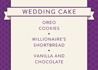
2. Note for the wedding (cheese)cake
3. Note for the Guest Book
4. Guest place cards for the dinner table (names were hand written)
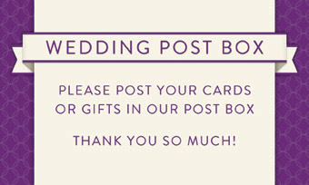
5. Note for the wedding post box (which was craftily made by the bride and myself)
6. Table plan (one table shown – there were 8 of these mounted in an A2 frame)
7. Label for the bottles of wine
Posted in Design, Graphic Design
Posted in Design, Graphic Design
Posted in Design, Graphic Design
Lovely Lovely
Let me take a moment to blow the dust off…
There! Long time no see WordPress; a new job and life in general get in the way sometimes! Anyhooo, on with the show.
I had a random urge to play around with the word “lovely” this afternoon. Here is the result:
I have a thing for white outlines with shadow :-) The pattern was free from the depths of the interweb but I knocked the argyle up in illustrator. Altogether it took less than an hour.
Stay tuned folks! I’ve got lots of personal projects in the works…..too many really considering I’m fully employed. Ahwell, who needs sleep, eh?
Posted in Graphic Design, Typography


